While the visual layer makes your data look professional, Distill Datasets and Dashboard configuration is where the real work happens. This is where you define exactly what data to fetch, how to link related sources, and how to calculate the metrics that matter.
Basically, how to get data in, how to connect it, and finally, how to shape it.
And remember to always use the Preview option in the Designer to verify that your filters and aggregations return the expected numbers before publishing.
Creating Datasets
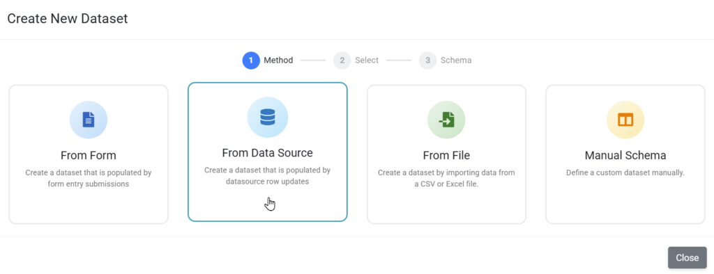
Before you can visualize data on a dashboard, you need to get it in by creating datasets that your charts and widgets can use.
Datasets can be created from:
- Data Entry Forms
- Data Sources
- File Imports (CSV or Excel)
- Manual Schema (Custom Dataset)

Selecting Sources & Multi-Level Linking
Every chart starts with a primary Table (e.g., Invoices). However, because business data is often spread across different areas, Distill supports Recursive Linking to traverse these relationships.
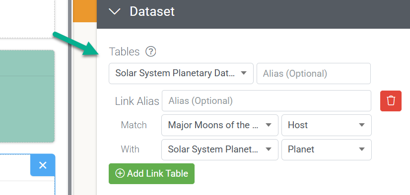
In dashboards, Recursive linking enables users to display data from multiple datasets in the same visualization. For example, use one dataset as a filter to update the data displayed in another dataset, and group data based on attributes in that dataset.
- Direct Links: Connect two tables directly (e.g., Sales → Customers) to see activity by client.
- Chained Links: You can link a new table to any previously linked table.
- Example: Sales (Primary) → Customers (Link 1) → Employees (Link 2). This allows you to group sales data by the specific Sales Rep’s name stored in the Employee table.

Narrowing the Scope with Filters
Filters ensure that your charts only calculate records relevant to the current goal.
Complex Logic (Groups)
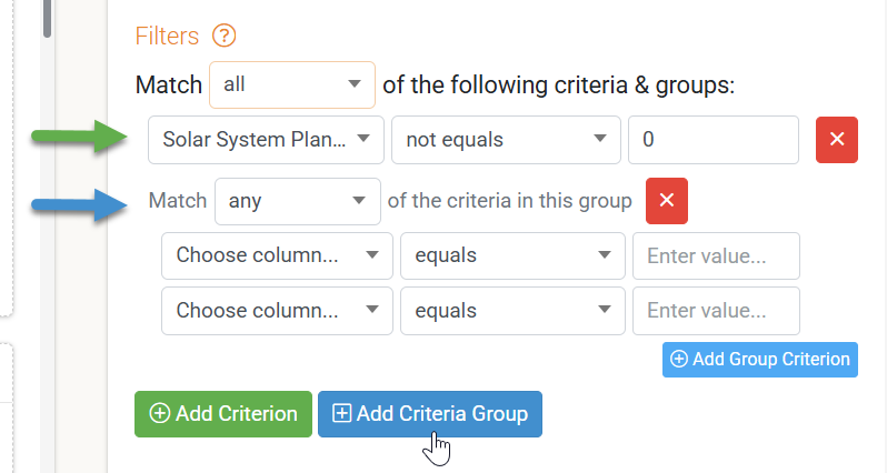
Use Groups to create nested “AND/OR” logic.
- Example: To find “High priority open tickets OR any critical ticket,” set the root group to Any (OR). Add “Priority = Critical” as one rule, then add a nested group containing “Status = Open AND Priority = High.”
Summary Filters
Unlike standard filters that look at individual rows, Summary Filters evaluate data after it has been calculated.
- Use Case: “Show me only customers whose Total Spend is greater than $10,000.”

Aggregation – Shaping Raw Rows into Metrics
Aggregation transforms hundreds of rows into a single, meaningful data point.
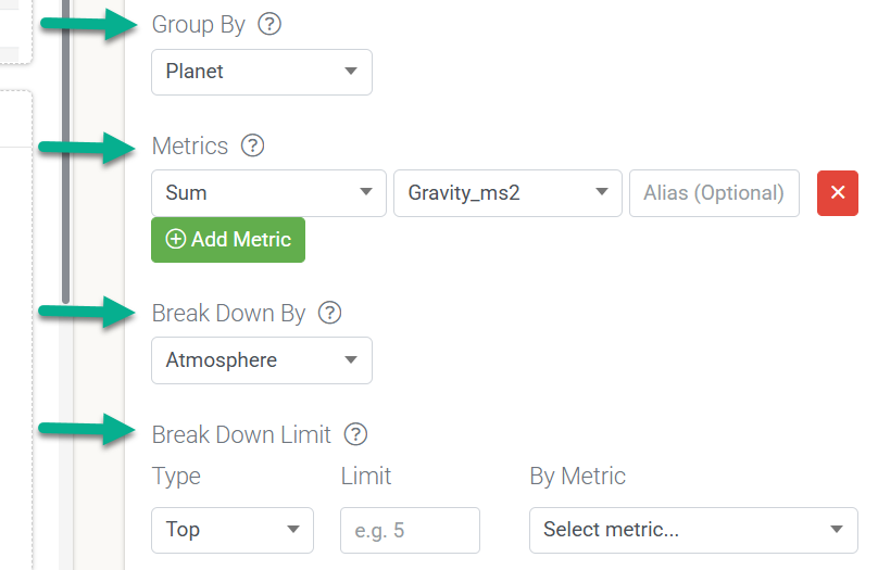
- Group By & Time Grains: When grouping by date, the Time Grain (Day, Week, Month) determines the “bucket” size. Selecting Week treats every entry from that Monday to Sunday as a single group for counting.
- Break Down By: This splits a single metric into segments. A Line Chart showing “Total Sales” becomes a comparison of “Product Categories” when you apply this setting.
- Break Down Limits: To keep charts readable, use a “Top N” ranking. If set to Top 3, a “Sales per Month” chart will only show the three highest-performing sellers for each month.

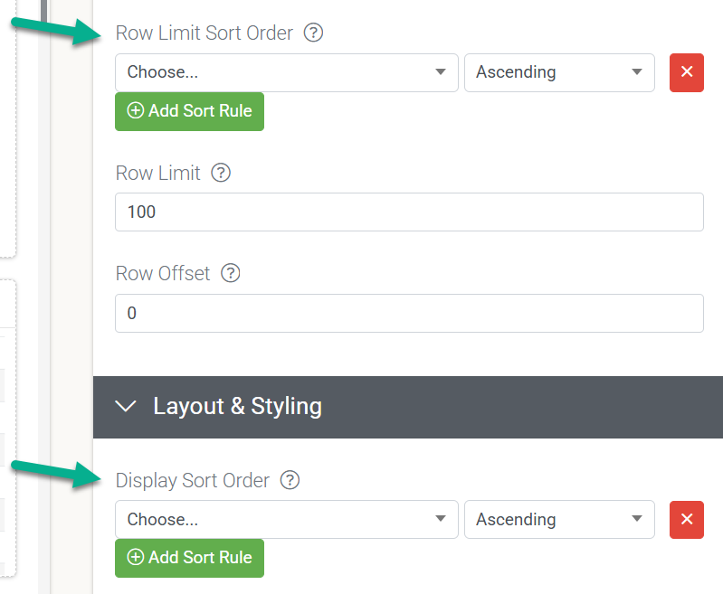
Sorting – Data Sort vs. Display Sort
It is essential to distinguish between how data is retrieved and how it is shown to the viewer.
Sort Type | Level | Best Used For… |
Row Limit Sort Order | Database | Ensuring you capture the correct “Top 10” items (e.g., latest dates or highest values) before limits are applied. |
Display Sort Order | Browser | Organizing the final results for the viewer, such as alphabetical sorting, for easier navigation. |