Choosing the right visualization is about more than just aesthetics; it’s the difference between a dashboard that tells a story, answering specific business questions, and one that just shows a mess of data.
Here is a quick-reference guide to help you pick the perfect chart or widget for your specific goals.
Goal | Recommended |
Comparing Categories | Bar Chart |
Showing Distribution | Pie / Doughnut Chart |
Tracking Trends | Line / Area Chart |
Highlighting a KPI | Value & Label |
Reviewing Raw Records | Table |
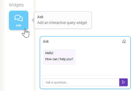
On-the-fly data Exploration | Ask Widget (Artifacts) |
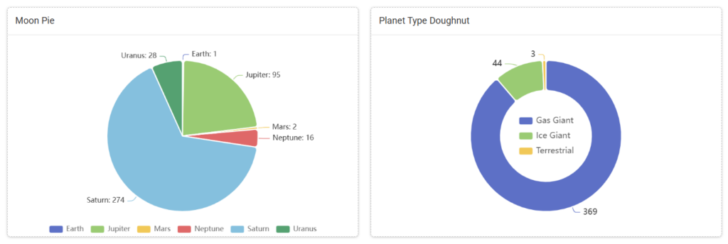
The Pie or Doughnut Chart
Best For: Showing “Parts of a Whole.”
- Use it when: You want to show how a total amount is divided into categories (e.g., Incidents by Severity or Submissions by Region).
- Design Tip: Avoid using more than 6 slices. If you have too many categories, the chart becomes unreadable. Consider a Bar Chart instead.

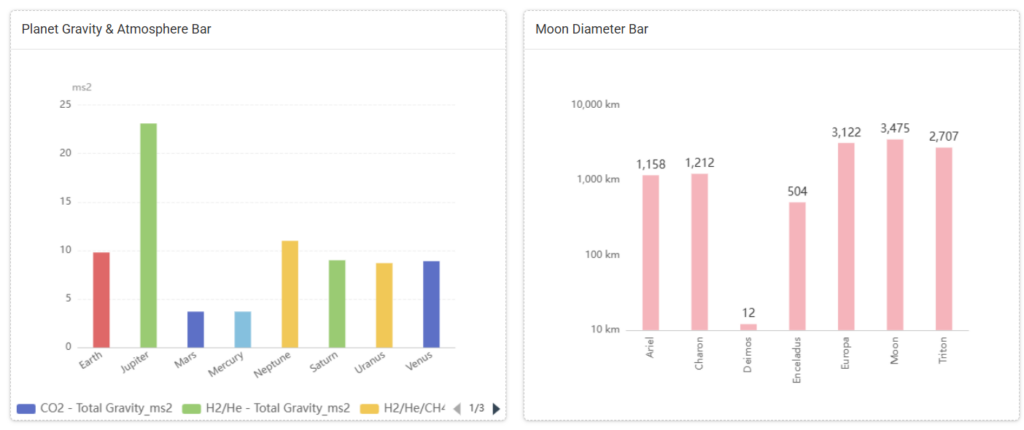
The Bar Chart
Best For: Comparing Quantities.
- Use it when: You need to compare different groups side-by-side (e.g., Number of Inspections per Month or Sales Performance by Employee).
- Design Tip: Use Bar Charts when your category names are long, as they provide more space for text labels than Pie Charts do.

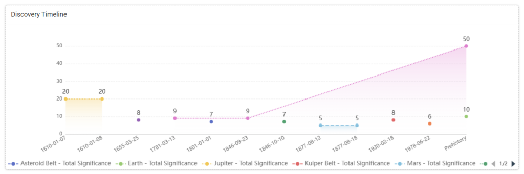
The Line / Area Chart
Best For: Seeing Trends Over Time.
- Use it when: You want to track how a metric changes over days, weeks, or months (e.g., Daily Safety Reports over the last 30 days).
- Design Tip: Keep your time intervals consistent (e.g., don’t mix days and months on the same axis) to avoid misleading the viewer.

Value & Label
Best For: Critical High-Level Metrics.
- Use it when: You have one “hero” number that everyone needs to see immediately (e.g., Total Active Projects or Average Safety Score).
- Design Tip: Place these at the very top of your dashboard. They act as the “headline” for the rest of your data.


The Table Widget
Best For: Granular Detail and Auditing.
- Use it when: You need to see the raw data behind the charts (e.g., List of the 10 Most Recent Incident Reports).
- Design Tip: Only include the most important columns (Date, ID, Status) to prevent horizontal scrolling on smaller screens.

Ask Widget (Artifacts)
Best for: On-the-fly exploration of uploaded Artifact data using natural language.
- Use it when: You want to allow users to ask specific questions that aren’t already answered by a pre-built chart, such as “What was the main cause of delays last week?”
- Design tip: Add a Heading widget next to the AI interface with a few “Sample Questions” to help users understand what kind of insights they can extract.