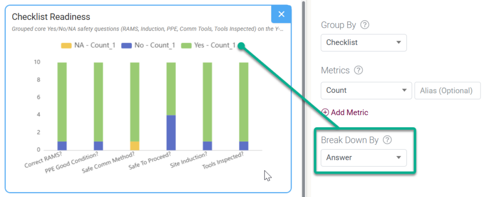
In traditional spreadsheet tools like Excel, you explicitly pick an X-axis range and a Y-axis range. However, Distill works differently—it thinks like a database.
Instead of looking for axes, Distill asks you two simple questions to build your graph:
- “How do you want to group your data?” ➔ This creates your horizontal X-Axis categories (e.g., grouping by Month or Region).
- “What math do you want to do?” ➔ This creates your vertical Y-Axis values (e.g., calculating the Sum of Sales or Average Cost).
Getting tripped up here isn’t uncommon when translating database queries (Group By / Metrics) into visual concepts (X-Axis / Y-Axis).
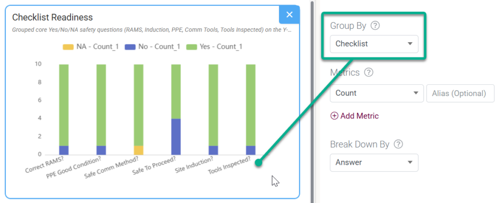
The X-Axis (Horizontal) = Group By
- What it is: Your categories, timeframes, or labels (Dimensions).
- Where to set it: The Group By dropdown in the Data settings.
- Why: This tells the chart how to slice the data horizontally along the bottom. (e.g., grouping rows by Month, by Region, or by Product Name).

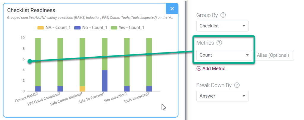
The Y-Axis (Vertical) = Metrics
- What it is: The numbers, totals, or math results (Values).
- Where to set it: The Metrics dropdown. You choose a column and an operation (Sum, Count, Average, Max, Min).
- Why: A chart cannot plot raw rows; it needs an aggregate number to determine how tall a bar should be or how high a line should go. (e.g., Sum of Total Price, Count of Customer IDs).

The Legend / Line Series = Breakdown By
- What it is: Your sub-categories (Secondary Dimension).
- Where to set it: The Breakdown By dropdown.
- Why: If you are tracking sales by month (X-axis), but want a separate line for each country, Breakdown By splits that single line into multiple-colored lines.