
These three examples showcase three entirely different chart widgets (Bar, Line, and Pie) and three distinct BI concepts (Geography, Time, and Volumetric Limits).
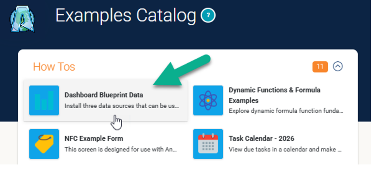
In our Examples Catalog, “Dashboard Blueprint Data” installs sample data sources that can be synced with Distill. Once synced, datasets are created that can then be used to replicate the following examples.
Bar Chart – Comparing Site Risk Profiles
What it showcases: Slicing a parent dataset by location and running an average calculation on numbers.
The Step-by-Step Configuration:
- Drag a Bar Chart onto your canvas.
- Under Data, select the parent dataset: 2 - SWMS Declarations Dataset.
- Go to Group By, select ProjectSite in the column box.
- Go to Metrics, click “Add Metric,” set the math operation to Average, and choose RiskScoreAverage from the dropdown.
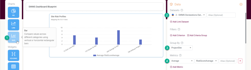
The Result: A clean bar chart showing exactly which project site holds the highest average risk rating.

Line Chart – Tracking Safety Activity Over Time
What it showcases: Grouping data by a time interval (weeks/months) to display operational trends.
The Step-by-Step Configuration:
- Drag a Line Chart onto your canvas.
- Under Data, select the parent dataset: 2 - SWMS Declarations Dataset.
- Go to Group By, choose 2 - SWMS Declarations Dataset in the first box, select SubmissionDate in the column box, and set the final dropdown to Week (or Month).
- Go to Metrics, click “Add Metric,” and set the math operation to Count.
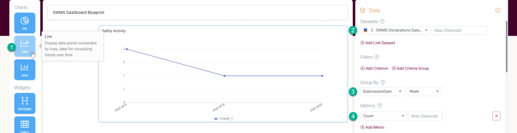
The Result: A clear timeline graph showing how many total SWMS safety forms are being submitted by your crews’ week by week.

Pie or Bar Chart – Identifying the Top 3 Field Hazards
What it showcases: Slicing child table data and using the Breakdown Limit tool to clear chart clutter without needing a date link.
The Step-by-Step Configuration:
- Drag a Pie Chart or Bar Chart onto your canvas.
- Under Data, select the child dataset: 3 - Job Steps & Hazards Dataset.
- Go to Group By, choose 3 - Job Steps & Hazards Dataset.
- (Note: At this point, the chart will look crowded because it is trying to show every single hazard).
- Go to Metrics, click “Add Metric,” set the math operation to Average (or Sum), and choose InitialRiskRating.
- Go to Break Down By and choose InitialRiskRating.
- Go to Break Down Limit and set Type to Top (Overall), type 3 into the Limit box, and select your InitialRiskRating metric in the By Metric dropdown.
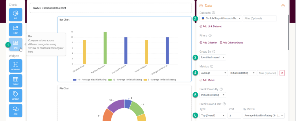
The Result: The chart dynamically filters out the minor issues and cleanly isolates the top 3 most dangerous hazards across your operations.